Ustad Ji Taking the Stage —
YouTube Music Digital Banner


click on button or
drag post to interact


Google Town
Its all about people
Reflection
This final year project taught me how to take one big creative idea and scale it perfectly across different mediums from a small mobile screen to a massive outdoor billboard without losing its impact. I learned how to use clean white space and subtle grey typography to balance the design, keeping the focus entirely on the colorful character illustrations. Most importantly, it showed me how to turn relatable Indian habits into modern visuals, proving that good art direction is always built on strong human insights rather than just pretty graphics.


Can You Find The residents of google town
Detective Byomkesh Bakshi Decoding the Details — Google Lens Full-Page Newspaper Ad
Detective Byomkesh Bakshi Decoding the Details — Google Lens Full-Page Newspaper Ad



Visual Breakdown
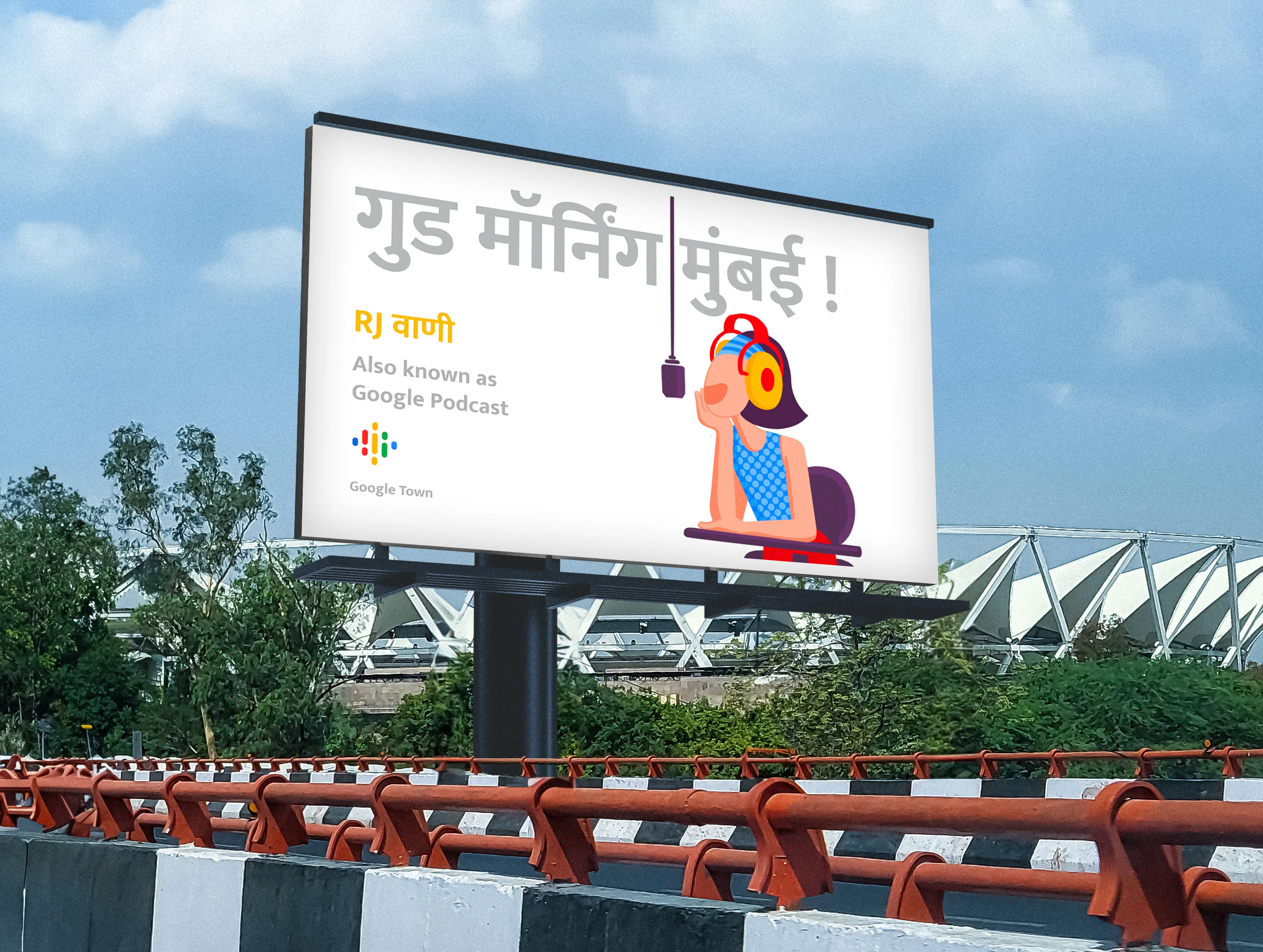
The layout uses intentional white space to replicate Google’s clean UI and make the core artwork pop. To control the visual weight, the illustrations and app logos are kept hyper-colorful, while the large dialogue headlines are rendered in a muted grey allowing the typography to stay highly legible without overpowering the characters.
Scrolling Through the Google Town — Instagram Interactive Experience
click on button or
drag post to interact
To design a human-centric integrated campaign that blends Google's abstract tech features with Indian cultural behaviors and nostalgic neighborhood characters (Google Town), making technology feel relatable and deeply human.
Brand : Google
Assignment Type : Integrated Brand Campaign
Objective : To make Google’s tech features deeply relatable by connecting them with familiar Indian characters and everyday habits.
Target Audience : Everyday Indian internet users (ages 18–45)
🏆 Campaign Recognition
Best Project in Communication Design — Annual Academic Excellence Award
Best Innovator of the Year —Aura Ad Agency, Mumbai
Brand : Google
Assignment Type : Integrated Brand Campaign
Objective : To make Google’s tech features deeply relatable by connecting them with familiar Indian characters and everyday habits.
Target Audience : Everyday Indian internet users (ages 18–45)
To design a human-centric integrated campaign that blends Google's abstract tech features with Indian cultural behaviors and nostalgic neighborhood characters (Google Town), making technology feel relatable and deeply human.
🏆 Campaign Recognition
Best Project in Communication Design — Annual Academic Excellence Award
Best Innovator of the Year —
Aura Ad Agency, Mumbai
Google Town
Its all about people
Brand : Google
Assignment Type : Integrated Brand Campaign
Objective : To make Google’s tech features deeply relatable by connecting them with familiar Indian characters and everyday habits.
Target Audience : Everyday Indian internet users (ages 18–45)
To design a human-centric integrated campaign that blends Google's abstract tech features with Indian cultural behaviors and nostalgic neighborhood characters (Google Town), making technology feel relatable and deeply human.
🏆 Campaign Recognition
Best Project in Communication Design — Annual Academic Excellence Award
Best Innovator of the Year —Aura Ad Agency, Mumbai
Google Town
Its all about people
Reflection
This final year project taught me how to take one big creative idea and scale it perfectly across different mediums from a small mobile screen to a massive outdoor billboard without losing its impact. I learned how to use clean white space and subtle grey typography to balance the design, keeping the focus entirely on the colorful character illustrations. Most importantly, it showed me how to turn relatable Indian habits into modern visuals, proving that good art direction is always built on strong human insights rather than just pretty graphics.
Reflection
This final year project taught me how to take one big creative idea and scale it perfectly across different mediums from a small mobile screen to a massive outdoor billboard without losing its impact. I learned how to use clean white space and subtle grey typography to balance the design, keeping the focus entirely on the colorful character illustrations. Most importantly, it showed me how to turn relatable Indian habits into modern visuals, proving that good art direction is always built on strong human insights rather than just pretty graphics.
Ustad Ji Taking the Stage —
YouTube Music Digital Banner
Padosan's Sharing the Town's Gossip — Google News Billboard
Pin-Drop Silence with Adhyapika Ji — Google Classroom Pole Kiosk
RJ Wani Tuning into the Town — Google Podcast Hoarding
Panwale Chacha Navigating Every Corner — Google Maps Pole Kiosk
The Dynamic Duo: Circuit and The Photographer — Google Assistant & Google Photos Magazine Ad
Visual Breakdown
The layout uses intentional white space to replicate Google’s clean UI and make the core artwork pop. To control the visual weight, the illustrations and app logos are kept hyper colorful, while the large dialogue headlines are rendered in a muted grey allowing the typography to stay highly legible without overpowering the characters.
Scrolling Through the Google Town — Instagram Interactive Experience
Ustad Ji Taking the Stage —
YouTube Music Digital Banner
Padosan's Sharing the Town's Gossip — Google News Billboard
Pin-Drop Silence with Adhyapika Ji — Google Classroom Pole Kiosk
RJ Wani Tuning into the Town — Google Podcast Hoarding
Panwale Chacha Navigating Every Corner — Google Maps Pole Kiosk
The Dynamic Duo: Circuit and The Photographer — Google Assistant & Google Photos Magazine Ad
Detective Byomkesh Bakshi Decoding the Details — Google Lens Full-Page Newspaper Ad
Padosan's Sharing the Town's Gossip — Google News Billboard
Pin-Drop Silence with Adhyapika Ji — Google Classroom Pole Kiosk
Panwale Chacha Navigating Every Corner — Google Maps Pole Kiosk
The Dynamic Duo: Circuit and The Photographer — Google Assistant & Google Photos Magazine Ad
Detective Byomkesh Bakshi Decoding the Details — Google Lens Full-Page Newspaper Ad
RJ Wani Tuning into the Town — Google Podcast Hoarding
Scrolling Through the Google Town — Instagram Interactive Experience
click and drag on
megazine to interact
click on button or
drag post to interact
Visual Breakdown
The layout uses intentional white space to replicate Google’s clean UI and make the core artwork pop. To control the visual weight, the illustrations and app logos are kept hyper colorful, while the large dialogue headlines are rendered in a muted grey allowing the typography to stay highly legible without overpowering the characters.